GRID
Set automatically growing rows.
grid-auto-rows:minmax(100px, auto);
If the content exceeds 100px, it will expand automatically.
.wrapper{
display:grid;
grid-template-columns:60% 20% 20%;
grid-auto-rows:minmax(100px, auto);
}
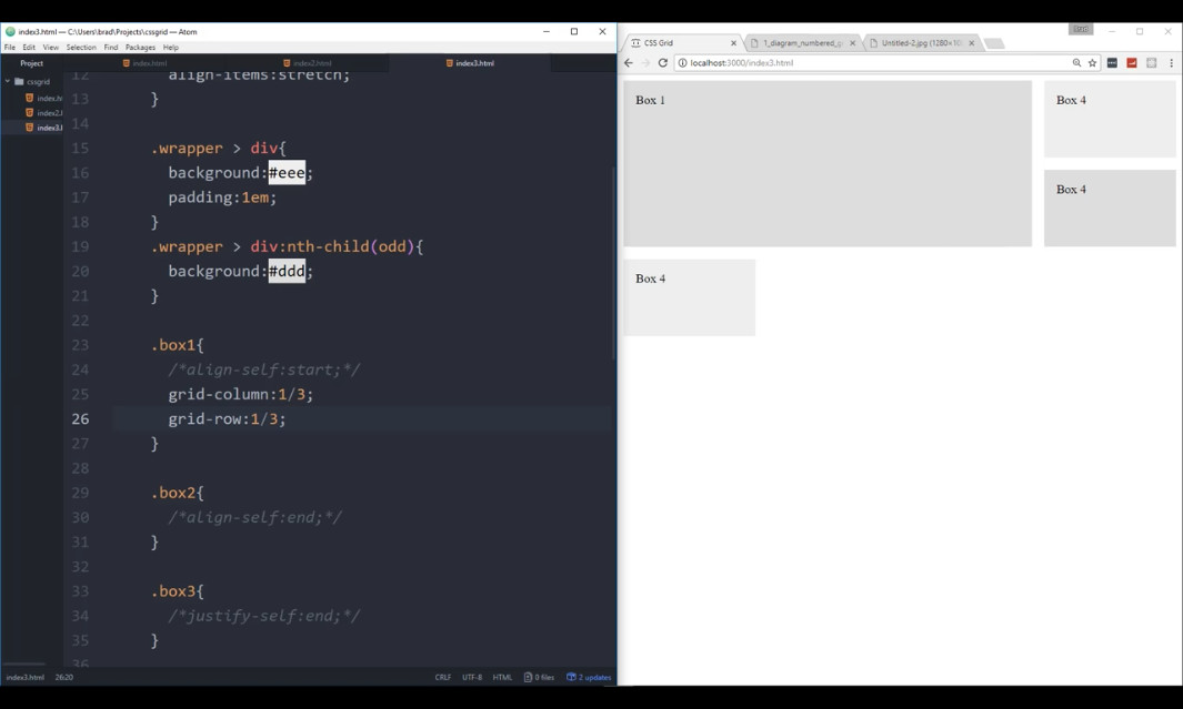
Span a column or a row:
.wrapper .box1{
grid-column:1/3; /*expands column 1 up to column 3*/
grid-columns: span 2; /*another way to tell it to span 2 columns*/
grid-row:1/3;
}
With CSS grid, it is possible to change the place of an element.
.wrapper{
display:grid;
grid-template-columns:1fr 2fr 1fr;
grid-auto-flow: column;
grid-gap: 10px;
}
.box1{
grid-column:3;
grid-row:1
}
.box2{
grid-column:1
grid-row:1;
}
.box3{
grid-column:1;
grid-row:1;
}
hover effect for a div:
.wrapper > div{
background-size:cover;
background-attachment:fixed;
transition: all 0.5 ease-in;
}
.wrapper > div:hover{
opacity:0.7;
transform: scale(0.98);
}
https://flexboxfroggy.com/
FLEXBOX FROGGY
Bring the frogs home one last time by using the CSS properties you've learned:
justify-content
align-items
flex-direction
order
align-self
flex-wrap
flex-flow
align-content